Spook House is a haunted house management game with tower defense elements. I helped develop it for about 1.5 years with a small team of 6 people. Throughout the entire development process I learned many things about design, mainly the development process.
I joined the development team in pre-development phase when the initial team just finished paper prototyping.I was tasked with developing a user interface that allowed the core game play features to function but as well as making 2D art for the icons.
The First Prototype
My first prototype. It was a semi interesting idea. Have the Menu underground and it would be brought up by clicking the hand. Unfortunately, this mockup never got implemented.
On my first two weeks of working on the project, I made a very basic menu interaction system that overall didn't really work.
This design was quickly scrapped as the menu interactions were confusing to use and took many clocks before players could find what they were looking for.
At this point in the design process, I was still kind of a novice who didn't do mock-ups and simple wire-frame prototypes. I realized that doing these things were important, which is when I started doing mock-ups/low fidelity prototypes.
Second Prototyping Phase
At this phase, I realized I needed to start doing some better prototyping practices. Below are some of the prototypes I've done.
This first prototype mock-up I color coded as well as detailing what each menu bit does. The goal of this mock-up was to detail to my team members what everything looked like.This UI was more streamlined and easier to use.
This picture details gameplay interactions as well as letting giving ideas to the designers on how placement of attractions worked.
This detailed towers that are active, in the sense that they need clicked before they could be used,
These mock-ups went through team discussion and was changed slightly, after they were changed I was tasked with making art style prototypes. So below are some of the art styles I came up with. Some of the icons were just stand-in graphics to show off what it could look like.
Art Style 1
Art Style 2
Art Style 3
These 3 art styles were used to help determine what kind of art style we wanted to do with the project. The main feedback I received from doing these art styles is that they were way too cartoony. The colored one was immediately scrapped as it made no sense, the other dark ones were also scrapped because of their cartoon like graphics.
After this discussion, I talked with my team and we wanted some art style that was dark and had a kind of hand-drawn feel to it. This was around when we had to submit our games to the Independent Games Festival (IGF for short).
This is the result of hand drawn art styles, we actually used this art style for a while.
This art style was what we went with for awhile, but ended up scrapping it entirely. The main reason being that from gathering data from user testing, we found that many people were confused on where to purchase things. Not to mention that the menu windows popping up were distracting and took away from the gameplay, as well as taking too many clicks per interaction. I learned a ton from this entire process and it was back to the drawing board. At this point, I had to make the menu interactions easier to use as well speeding up player interactions between the UI and the game.
To help get a better look at this art style in action, check out the IGF trailer!
Third Prototyping Phase
Alright, after the IGF festival, the prime thing I was trying to do with these next level of prototypes was to make it a simpler and more cohesive design. It is also important to know that we were changing the way the game played,. Instead of having a pre-built house, players would instead build their own house as they went. Which added new UI elements as well as new menu interactions.
My first step here was to do some research on some similar games, my main focal point of research was looking at how other games (tower defense and tycoon sim games) handled their menu interactions. Some games I looked at were games like: Plants Vs. Zombies, Bloons Tower Defense 5, Gemcraft, Kingdom Rush, and Roller Coaster Tycoon. I learned that these games all feature permanent UI elements that stayed on the screen for quick and easy access. This helped speed up their gameplay and kept the gameplay fast paced.
Below are some the first wire-frames I developed to handle the previous problems as well as use my research to build a better user interface for the game.
Like other Tower Defense Games, this UI featured a permanent place where players could place their towers easily and faster.
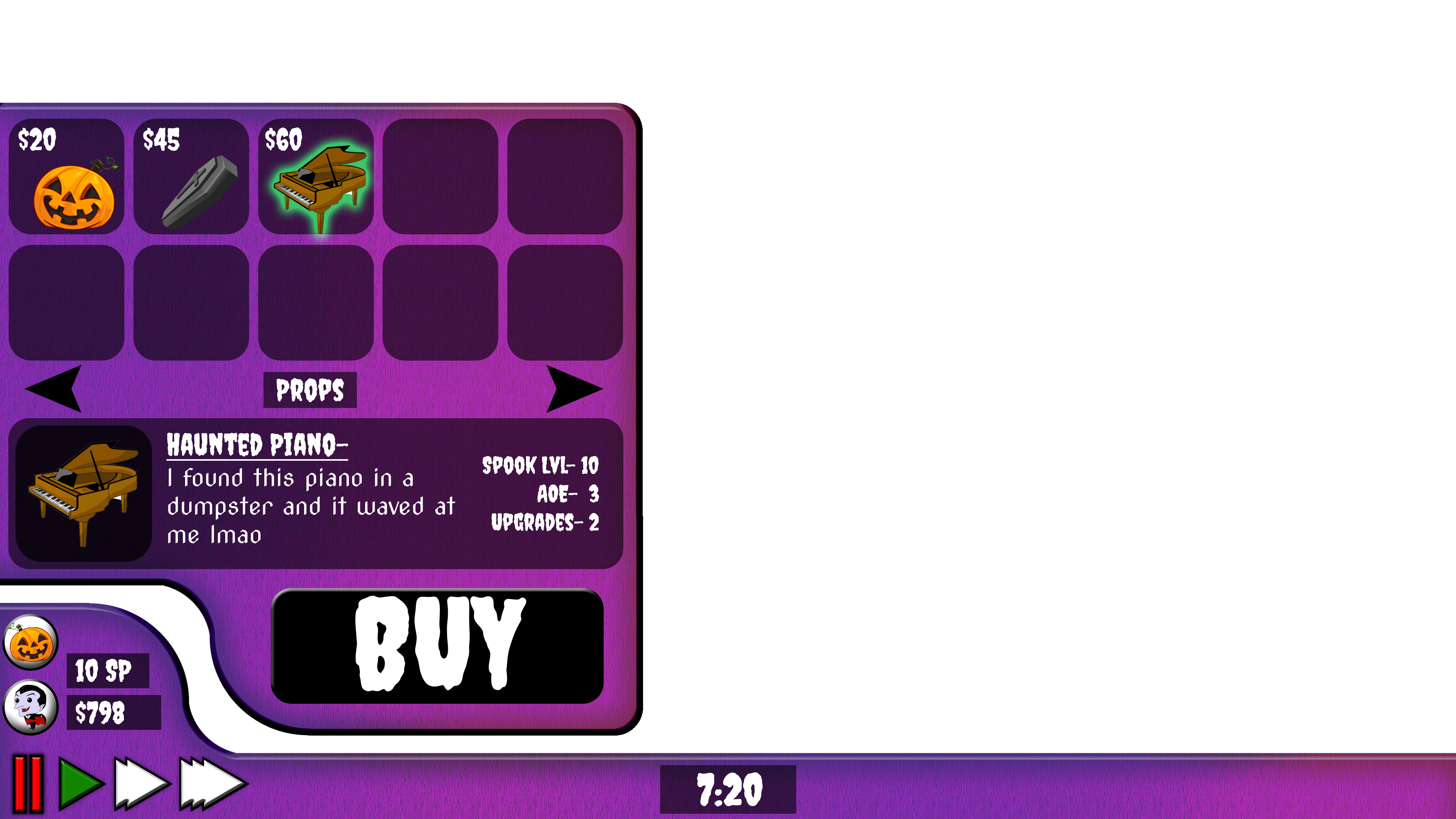
This is detailing what happens when players would click on a tower, it goes very in depth and explains what each item is.
This details how the upgrading would work and look.
After discussing this with my team, we decided to move forward with these designs. I started work on doing various art styles and we finally had something that worked well for the game. After getting some stand-in art, we conducted testing and found that players who had previously tested the game, really liked these new changes.
Not to mention, we upgraded the way we conducted testing at this point using a handy test report using google forms. Located here:
I was actually kind of at a standstill with what art style the team wanted, but in the end we decided an art style similar to Tim Burton art style. Dark shaded outlines, dark colors, dark theme, dark etc. So I whipped up an art prototype of what the sidebar could look like using this new art style, I wanted to make it spooky but also have it stand out from the rest of the art in the game.
I made this one in Photoshop. It was later changed and modified to be slice variant UI, which used tile sprites.
Now I will show you gifs of some of the user interface in action!
Some menu interactions showing off the menu screen.
Some more Menu interactions, showing off how players would buy rooms for their house.
Conclusion
Spook House has taught me valuable insight on the design process. Not only did I learn the correct way to start a design, by doing research then wireframing, but it also taught me how to effectively communicate with my team. I used Slack, Trello, Asana, and source control apps daily.
Graphic Designer for Indiana University's first satirical newspaper. I did work for print issues, as well as social media photos that went along with written headlines!
Graphic Designer for Indiana University's first satirical newspaper. I did work for print issues, as well as social media photos that went along with written headlines!